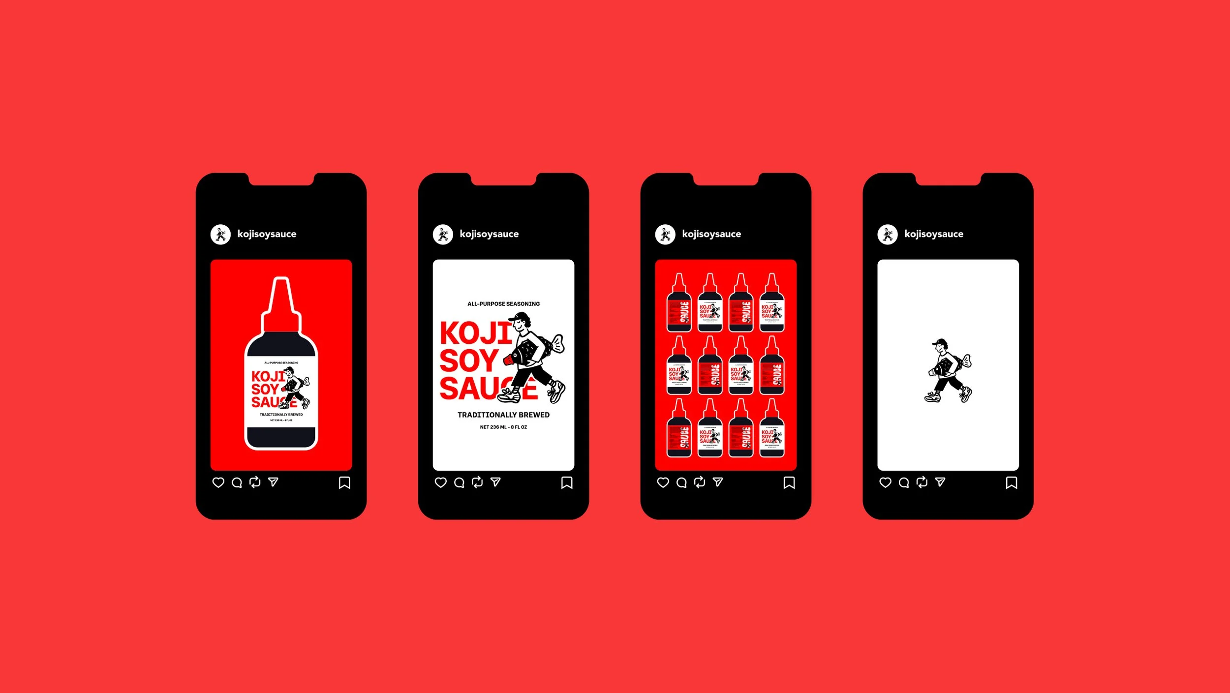
Koji Soy Sauce
KOJI is a playful take on traditional soy sauce branding, designed to bring personality, humour and a fresh perspective to an everyday kitchen staple.
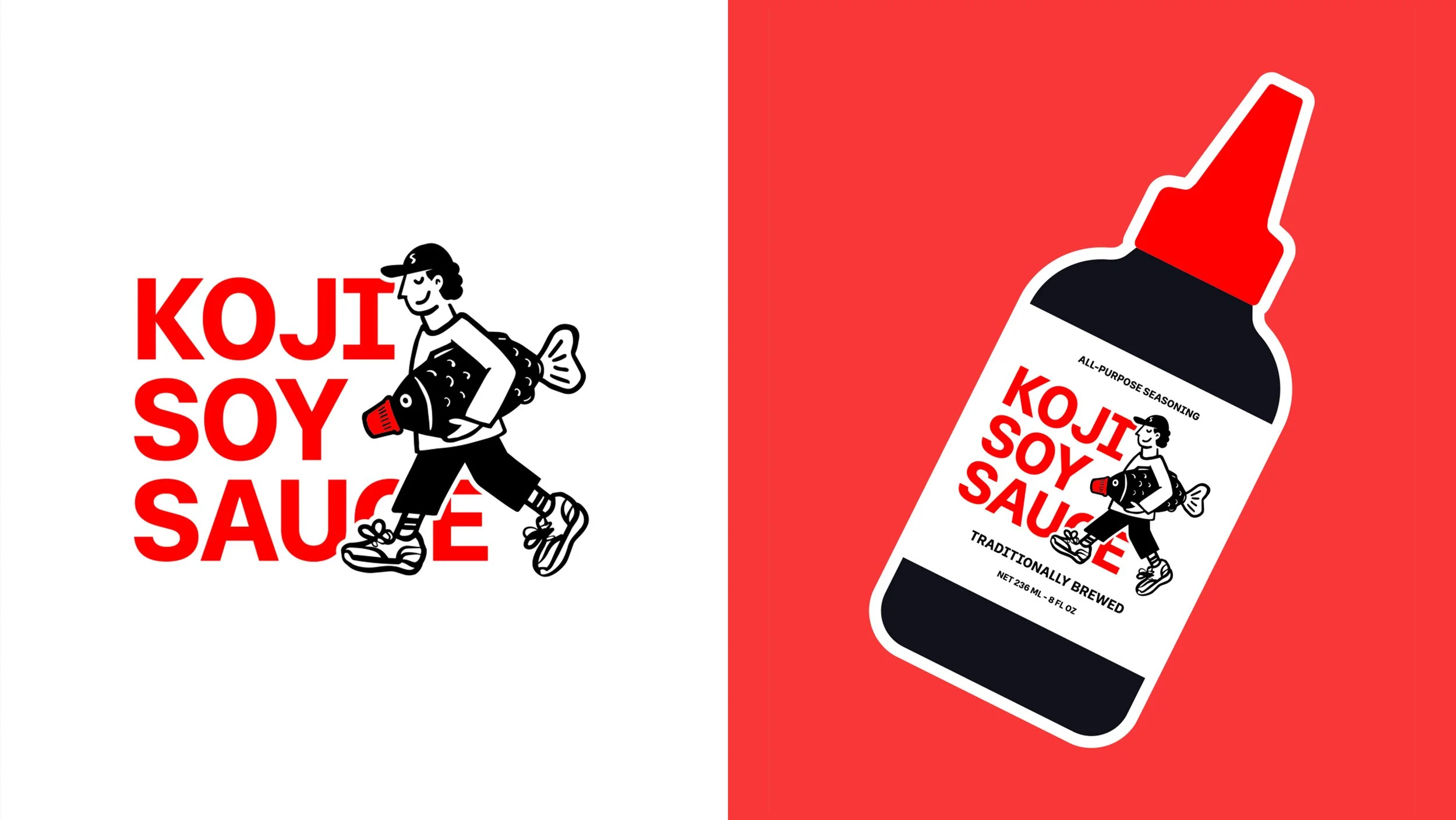
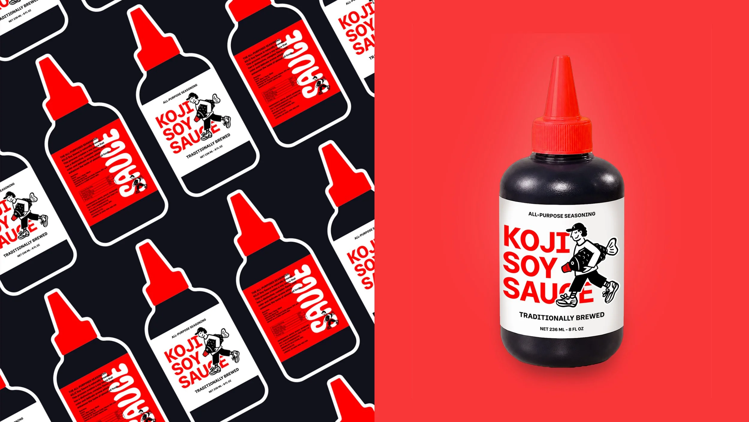
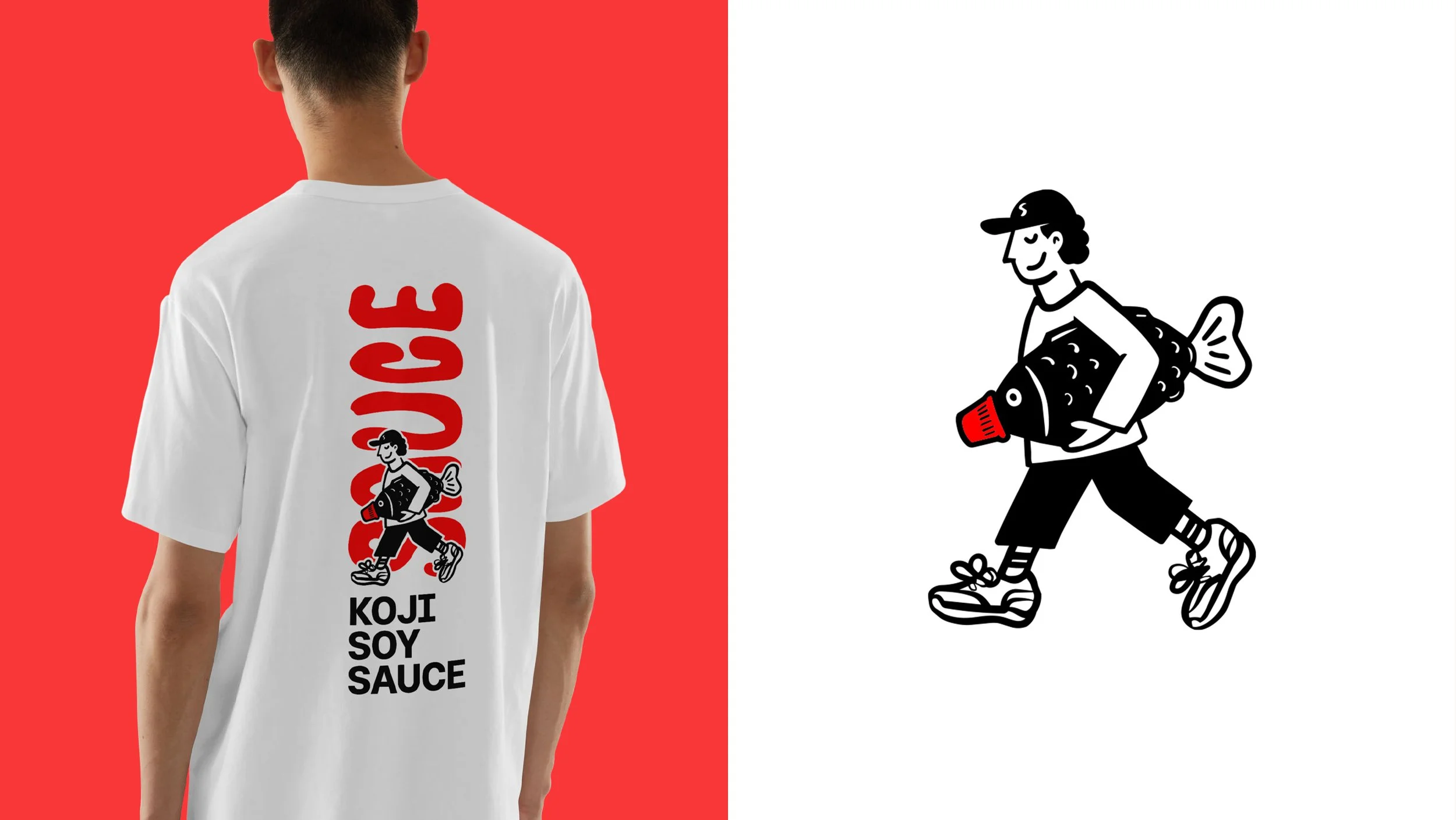
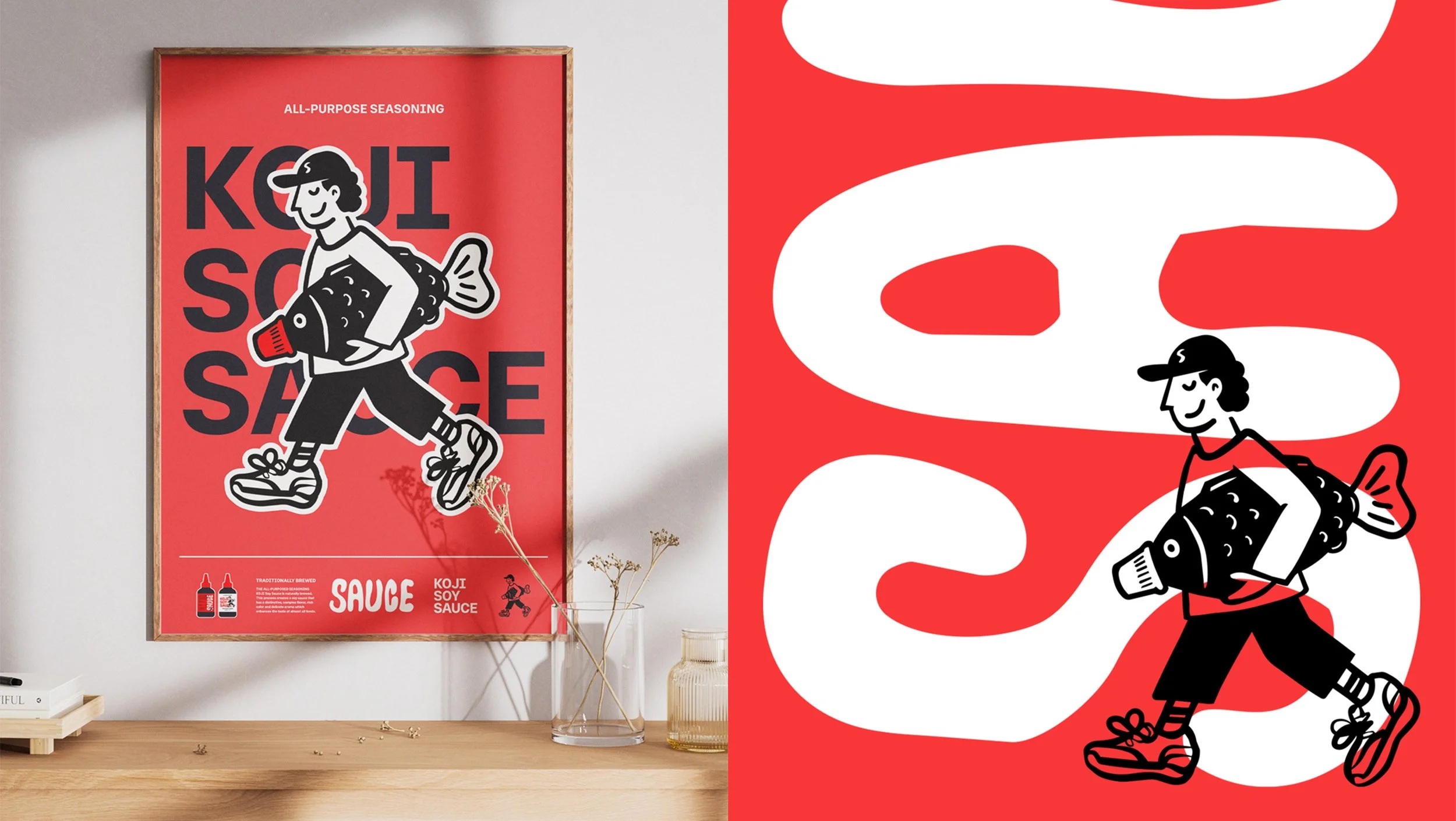
At the heart of the identity is a simple yet memorable idea. The bold typography with the illustration and a distinctive bottle design, creates a visual identity that feels both nostalgic and contemporary.
The quirky character and an unconventional visual approach make the brand instantly recognisable, approachable and hard to forget. KOJI transforms a familiar product into something with its own personality, proving that even a traditional condiment can stand out through creativity and a little fun.
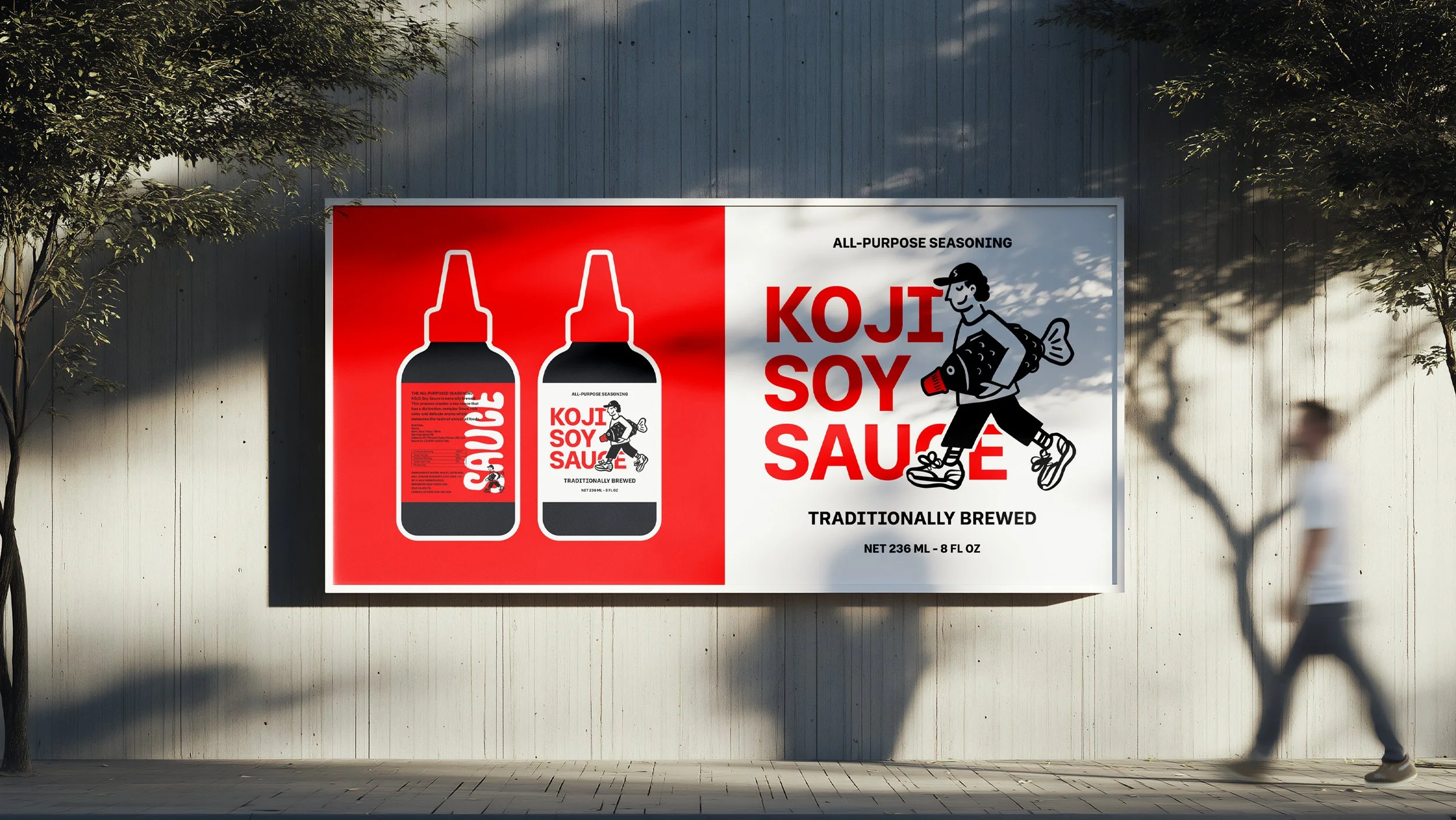
The project focused on developing a distinctive brand identity and packaging design for KOJI, a soy sauce brand that brings a fresh, playful perspective to a traditional food product. The aim was to create a visual identity that stands out on the shelf, communicates personality and makes an everyday condiment feel more exciting and approachable.
Services: Brand Strategy · Visual Identity · Typography · Packaging Design
Industry: Food & Drink
Project Type: Conceptual Brand Identity
The Challenge
The main challenge was finding a balance between humour and professionalism while creating a brand that remained recognisable as a food product. The identity needed to feel playful without compromising clarity, product appeal or functionality. It was important to move away from predictable food branding and develop a concept with a strong visual personality that would leave a lasting impression.
Scope of Work
The project involved developing the overall brand concept and visual identity, including logo design, custom typography, character illustration, colour palette and packaging design. Particular attention was given to creating a consistent visual language across the branding and bottle label, ensuring every element worked together to establish a memorable and cohesive identity.

The Concept
The concept behind KOJI is to give a traditional soy sauce a distinctive personality through humour and unexpected visual storytelling. The central illustration features a quirky character carrying an oversized fish soy sauce container, creating a playful connection to food while giving the brand a recognisable mascot. The idea was to move away from conventional food packaging and create something bold, unconventional and full of character.
The Outcome
The result is a playful yet confident brand identity that makes an everyday condiment feel exciting and memorable. Through its bold typography, limited colour palette and humorous illustration, KOJI stands out from traditional soy sauce packaging. The final identity is cohesive across the logo and bottle design, creating a brand that feels contemporary, approachable and instantly recognisable.